Do you consider your client’s wedding album experience or how you can make their life easier?
As a wedding photographer myself I know that the entire album workflow can be daunting, as there are a many steps and it can be very technical; you need to learn about tools to design albums, tools to present your album design, tools to host your gallery and understand all the different options that an album provider offers you. The good news is that there are a lot of good and intuitive tools that streamline the wedding album process – for the photographer. The question is what is the workflow for your client? How do they feel about the entire album process? What should you consider to make their life easier?
Emotional Connection
 The most important part of your client’s album process is to manage their ‘experience’ with your service and help them to create an ‘emotional connection’ between them and their wedding book. Their ‘experience’ of your service starts from the time you have your first pre-meeting and finishes when you deliver your final deliverable – which usually is the wedding album. You can take amazing photographs, but if you client had a bad experience along the way, then this will impact their overall experience and can lead to them not recommending you as a photographer, or not buying your products. The more your client is emotionally connected to their wedding album, the more they will want to invest in their wedding album. Therefore, I would like to repeat myself. Managing your client’s ‘experience’ and “emotional connection” is key.
Photographer’s album workflow
While researching this article, I spoke to several photographers to understand their workflow – as everybody has their own of doing things. I asked my photographer friends how they would go about creating the first draft of an album. For photographers who choose to operate online, the outcome can be generalised into two workflows
- The photographers asks the client for their favourite wedding photos from their gallery and create an album design based on those photos
- The photographer designs the first draft without any input from the client.
The common part for both of these workflows, is that after the first album design the album draft is sent to the client. And then you wait. This part is key so pay extra attention to this – the longer the client takes to respond, the more emotionally disconnected they get from their wedding experience. It is natural if you think about it – the client will be tired with wedding related, because preparing a wedding is very time consuming and takes a lot of energy. However, a wedding is such an emotional day that one tends to stay “emotionally connected“ for quite some time. But over time this fades. This is the “window” where you, as a photographer, normally request feedback from your client. It is very important that we are efficient and give your client a good experience. If you do not, you might leave them with a bitter taste of what is the last piece of puzzle of your entire service.
You can also see it this way – as wedding photographers we tend to provide deliverables such as blog post, photo gallery, wedding photos, prints and wedding album. Some do more, some do less. However, out of all these deliverables, the wedding album is the only one where we actually need input from the client. This is the one time we are asking for something from the client and not the other way around.
Client’s album workflow
What does the client do when they receive their album design? It might sound obvious but they will check if they like the photos inside the design. They will try to see if there is a another photo that they might like more for that particular spread. As you know, a photo by itself is very different from a ‘photo inside a spread’. Sometimes a photo you do not like by itself is perfect for a spread because it tells a story or emotion you are trying to convey. And here is a vital moment of the review – how do you make it easy for your client to do this review?
Before we answer that question – what is it that we usually provide to our clients to enable them to give us feedback? I have heard of a number of ways, but it can be generalised down to two things:
- Album Design in one shape or another. Some people use a PDF and some use an online album proof tool.
- Photo Gallery. Either on a DVD/USB stick with photos or an online gallery.
And then we ask for feedback via a tool or an email. This is where our job as photographers stops and begins for our client.
In my case I used an online gallery (which had file names under each photo) and then an online album proof tool where the user could write comments under each spread. If they wanted a photo replaced I requested the filename. We communicated via the tool. Personally, I think this is better than giving them a PDF and JPEG files where they then write an email with their changes. I thought my workflow was pretty good, but still noticed it took a long time to get feedback from my clients.
Survey Feedback
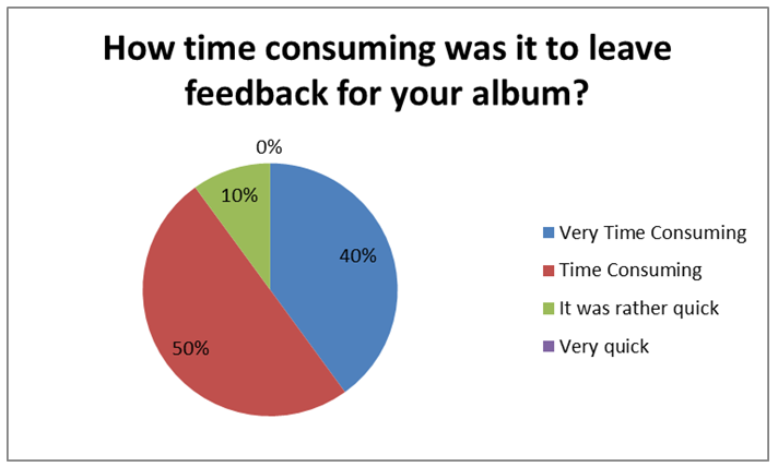
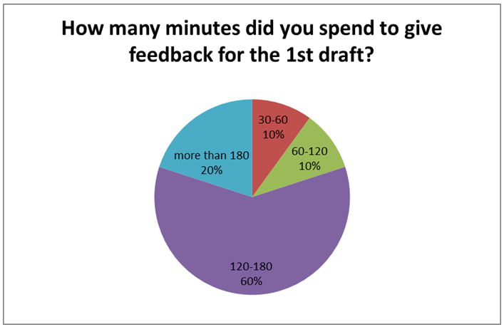
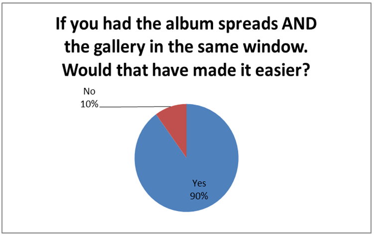
I created a survey and asked 20 of my couples – this was the outcome:


What was the easiest part of leaving album feedback?
– “Being able to directly comment on the album instead of communicating edits through email.”
– “The notes section”
– “Submitting back and forth was relatively seamless”
What was the most time consuming part in leaving album feedback?
– “accessing the pictures, going back and forth between the album and the pictures to see what options there were”
– “Flipping back between the gallery and the album to find shots we preferred”
– “switching back between the gallery and the commenting tool. It took months to complete something that should really take a matter of days/minutes at the most, simply because it was too tasking to complete in one sitting”
What would have made the entire process easier?
– “It would have made it easier if we could see the pictures in the album draft, and put comments directly on the picture we proposed edits to. We would have also liked to be able to zoom in on the pictures closer so we could ascertain whether those pictures would look good once enlarged on the album page. It also would have been easier if the comments we proposed “listed our username, so that more than one person could propose comments without having to be in the same place, at the same time without causing confusion.”
– “being able to pull up the available pictures within the same window and maybe some kind of sorting mechanism”
– “If there were options for some photos. For example, if there are 6 shots of us in the same location, if they were somehow together on the spread so we could go through directly in the album and pick the one we liked best”
I will not analyse the results in any great detail, as statistics can always be pulled in whatever direction you want. However, for me, it became pretty clear that leaving album feedback was not something you did quickly together with your hubby on the sofa with your iPad. Rather it became an activity you saved for a “rainy day”.
How can we improve this experience for the client, and make it something they look forward to completing with a glass of wine? We need to make the process easy and quick to provide their feedback. If it is easy and intuitive, then they will see it as a good experience and if it is quick, then the window after the wedding is shorted and you client is more emotionally connected.
One way you can achieve this is to go through the album design with your client in person (or via Skype) and guide them. This would make it much quicker for them and you can answer any questions they may have. Personally, I like the fact they can give feedback in their own time and are also less embarrassed to say they don’t like certain spreads/photos. This is why I use online tools to collect feedback.

Based on the feedback I was given I wanted to provide them a tool which made it easier for them. I created a proofing tool, called AlbumParrot, that integrates album spreads and galleries into one window. As a photographer I like visual feedback so I created conversation windows, which they can drag and drop photos onto the spread and provide their feedback in context. They no longer need lengthy descriptions of where they want a change. Some other “fancier” features such as integration with leading online album galleries and creating “apps” were added – but that was to make it nicer for the photographer.
Managing your client’s “experience” and “emotional connection” is key to repeat business and recommendations. When I spoke to other photographers I often heard “I only get a few comments from my clients” so I assume that the process is good for them. Do not assume and ask instead. If you do that, then you will have a happier client who buys more from you. Win win.

